Crystal Head Vodka
Paint Your Pride
In 2022, I led the redesign of Crystal Head Vodka’s Pride bottle, which launched in 2023. The brand was looking to boost sales by generating excitement and a sense of exclusivity through a limited edition strategy, which was executed through new packaging as the bottles are popular collector’s items.
Client: Crystal Head Vodka
Studio: In-house
Role: Design lead, art direction, copywriting, photography, videography, production management
Project Date: 2022-2023
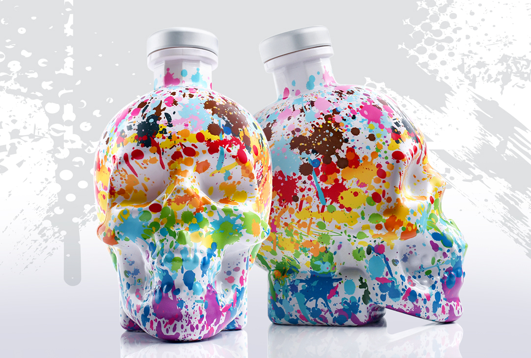
Marketing Collateral
new copy goes here
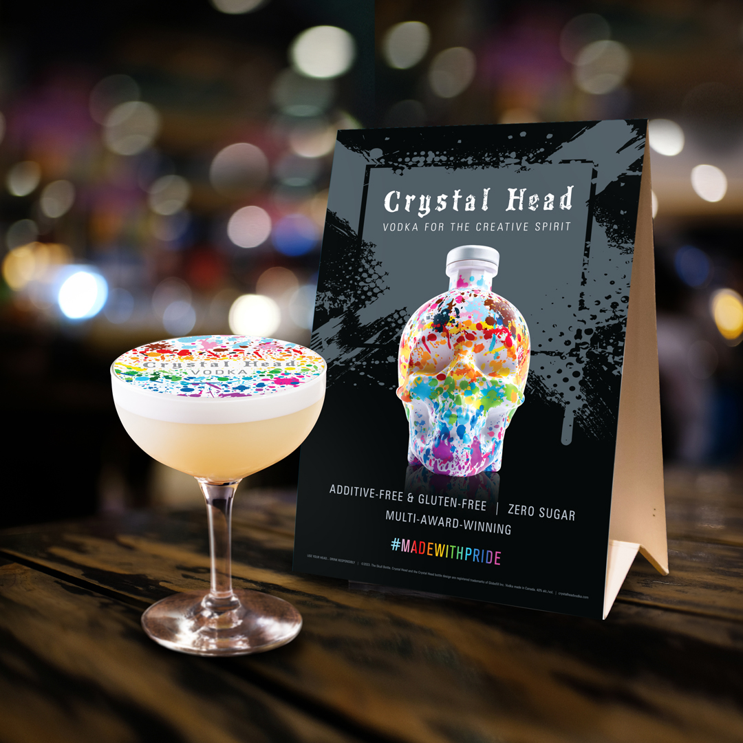
Printed rice paper cocktail topper / Table tent
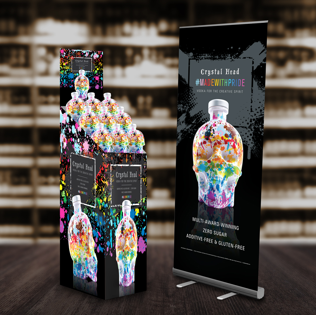
Retail display bin for US markets / Pop-up banner
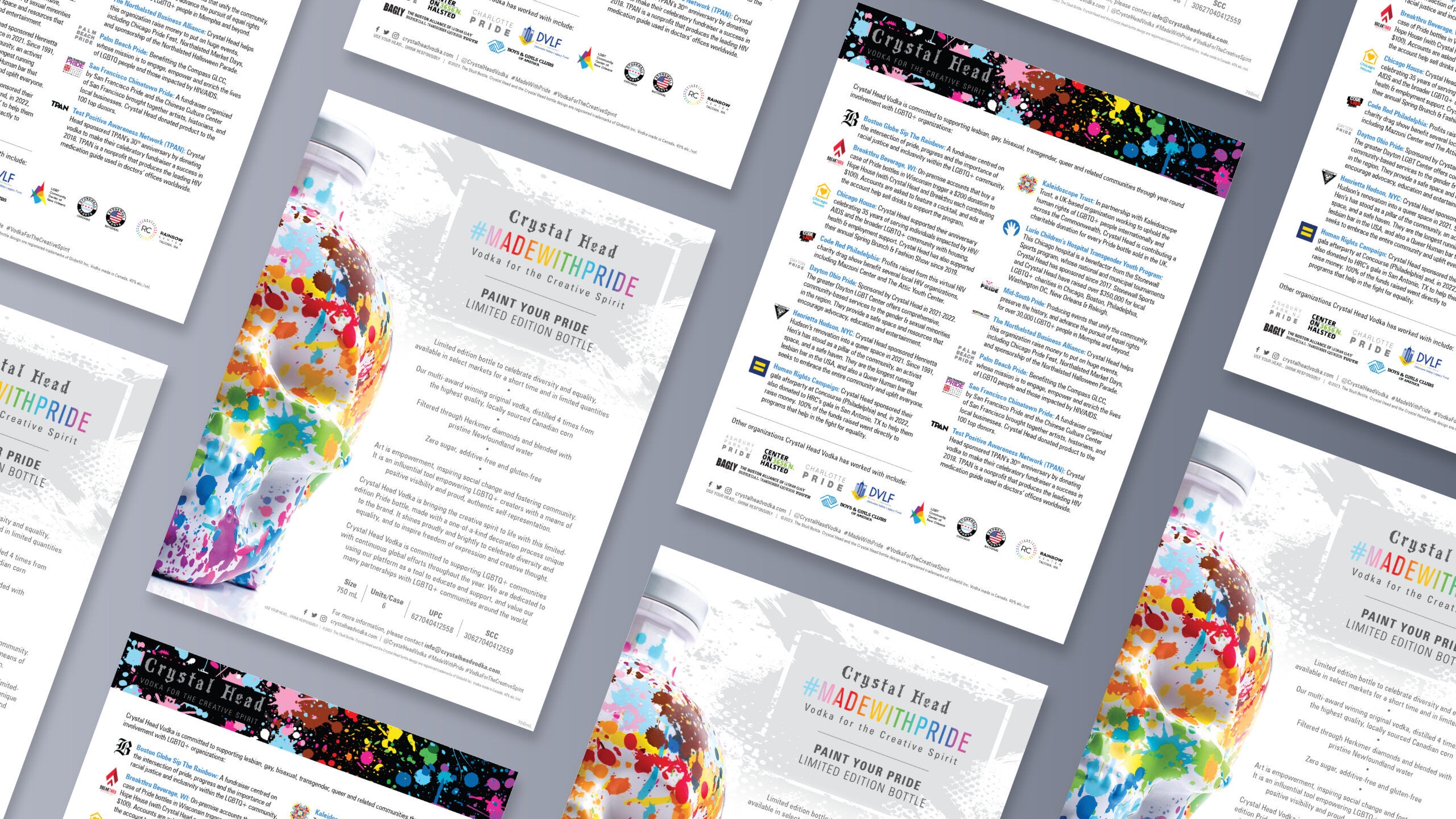
Product sell sheet and info sheet about LGBTQ+ organizations Crystal Head has partnered with
Copywriting

Photography


The Process
Ideation
Work on a new redesign began after Crystal Head had run with a rainbow bottle for 3 years, and wanted to stand out by taking a more creative approach than the commonly-seen rainbow stripes.
The marketing team and I each presented several concepts for the new glass. After the first round of ideation, I produced quick mockups of the strongest ideas to better illustrate how we envisioned them on the bottle. We worked with different internal teams to narrow down which ideas we would elaborate on, based on market feedback about what concepts were expected to be received favourably.
Our ideas were further refined when early manufacturer samples were produced, and we found that some did not evoke the correct theme. For example, we rejected our first iteration upon finding that it reminded people of 1960s psychedelia more than LGBTQ+ Pride.
Production
I coordinated with the manufacturer, Saver Glass, to determine the artwork’s placement on the bottle.
It took a few iterations to get the desired result, since printing on a non-standard bottle shape caused the artwork to distort on certain contours. On initial production samples, we discovered that the distortions resulted in some key parts of the artwork printing in undesirable locations, or not showing up on the consumer-facing sides of the product at all. After working together to adjust accordingly, the bottle was ready for production.
Marketing
[text goes here]
Outcome
Distribution
Approximately 80,000 units were produced on the first production run. The bottle was made available to the 80 countries where Crystal Head Vodka is sold, and uptake was highest in Canada, the USA, Europe, Australia, and New Zealand.
![CHV Pride Market Distribution Map [2025]](https://jesstsangdesign.com/wp-content/uploads/2025/05/CHV-Pride-Market-Distribution-Map-2025.png)
Publicity
The Pride bottle’s initial release onto the market was celebrated with a launch event at Harvey Nichols in London, UK, in May 2023. In the following weeks, the product rolled out in other markets and a press release about its global launch was published. Within 24 hours, the press release was picked up by over 430 media outlets (such as Yahoo Finance and KTLA 5), with a total projected audience of 230.8M viewers.
Beyond the press release, it received over 60 unique pieces of coverage from outlets including Ad Age, Global News, Forbes, CBS, NBC Access Hollywood, USA Today, and Metro UK.
Photo credit:
![[PR] 2023-06-02 immrfabulous [Global News Calgary]](https://jesstsangdesign.com/wp-content/uploads/2025/05/PR-2023-06-02-immrfabulous-Global-News-Calgary.jpg)
Featured on Global News Calgary. Click here to watch the segment (opens in a new window).
Paint Your Pride got additional reach through more than 30 social media posts by influencers we partnered with. Through other partnerships and sponsorships, it also received publicity through events such as WeHo Pride (West Hollywood, USA), organizations like Kaleidoscope Trust (UK), and a PR tour by Ghostbusters actor and Crystal Head co-founder Dan Aykroyd.
![[PR]-2023-06-21-Kaleidoscope-Trust-Summer-Reception-rete-21-06-2023-0455](https://jesstsangdesign.com/wp-content/uploads/2025/05/PR-2023-06-21-Kaleidoscope-Trust-Summer-Reception-rete-21-06-2023-0455.jpg)
Kaleidoscope Trust summer reception. Photo credit: Kaleidoscope Trust
Caption
![[PR] 2023-06-19 @HoorayMae [Mae Martin IMG_6409]](https://jesstsangdesign.com/wp-content/uploads/2025/05/PR-2023-06-19-@HoorayMae-Mae-Martin-IMG_6409.jpg)
Instagram post by comedian Mae Martin
Caption
Personal Reflections
The lifestyle photography I took, which appeared in media hits, was shot in my father’s personal studio. These images were personally significant, since the art supplies shown in them are the same long-enduring ones my father and I used to make many of my earliest childhood artworks, at the beginning of my creative journey.
I was also very appreciative that Crystal Head Vodka took an unwavering pro-LGBTQ+ stance while the political climate of the time was seeing an increase in anti-LGBTQ+ activity. While many other brands stayed silent on the topic or withdrew their Pride marketing altogether, Crystal Head publicly declared its steadfastness in maintaining its long-standing relationships with LGBTQ+ communities and organizations that directly benefit LGBTQ+ people.
Credits
Additional Photography and Videography: Rhys Jones, Lateef Okunnu, Pandosy Collective
Marketing: Kristina Cappellini, Daniella Vizzari & Anita Marinho
PR: Domino Communications, Crowe PR
Translation: Zakaria Anagra, Milena Bosco, Valentina del Valle Betancourt Garcia, Joseph Oyede
View more projects
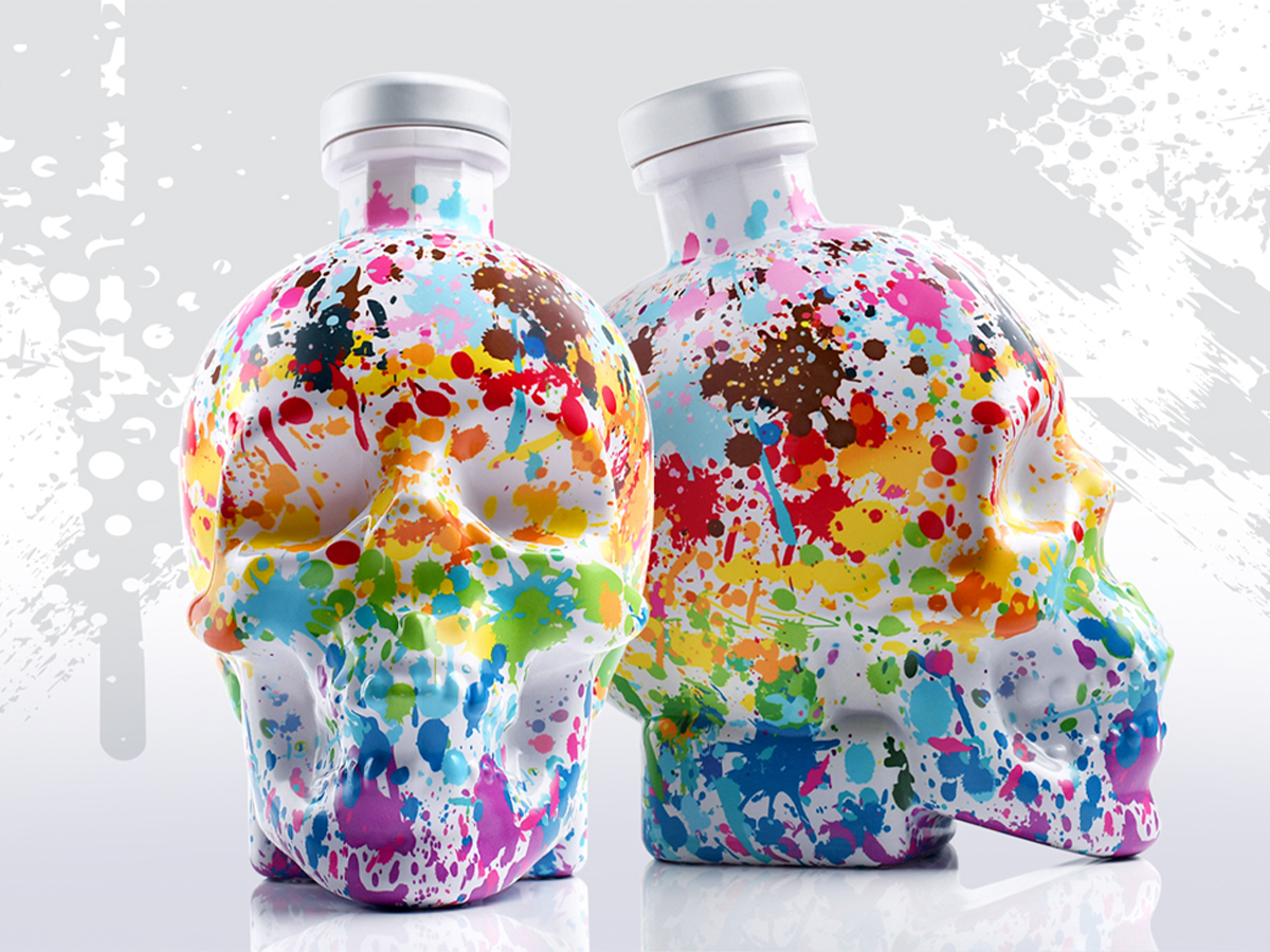
Crystal Head Vodka - Paint Your PrideArt Direction & Design
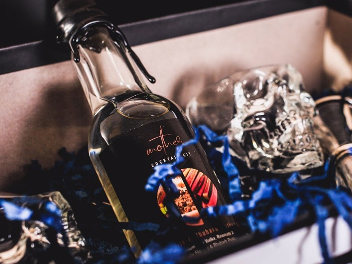
Mother Cocktail Bar + Crystal Head VodkaBranding & Graphic Design
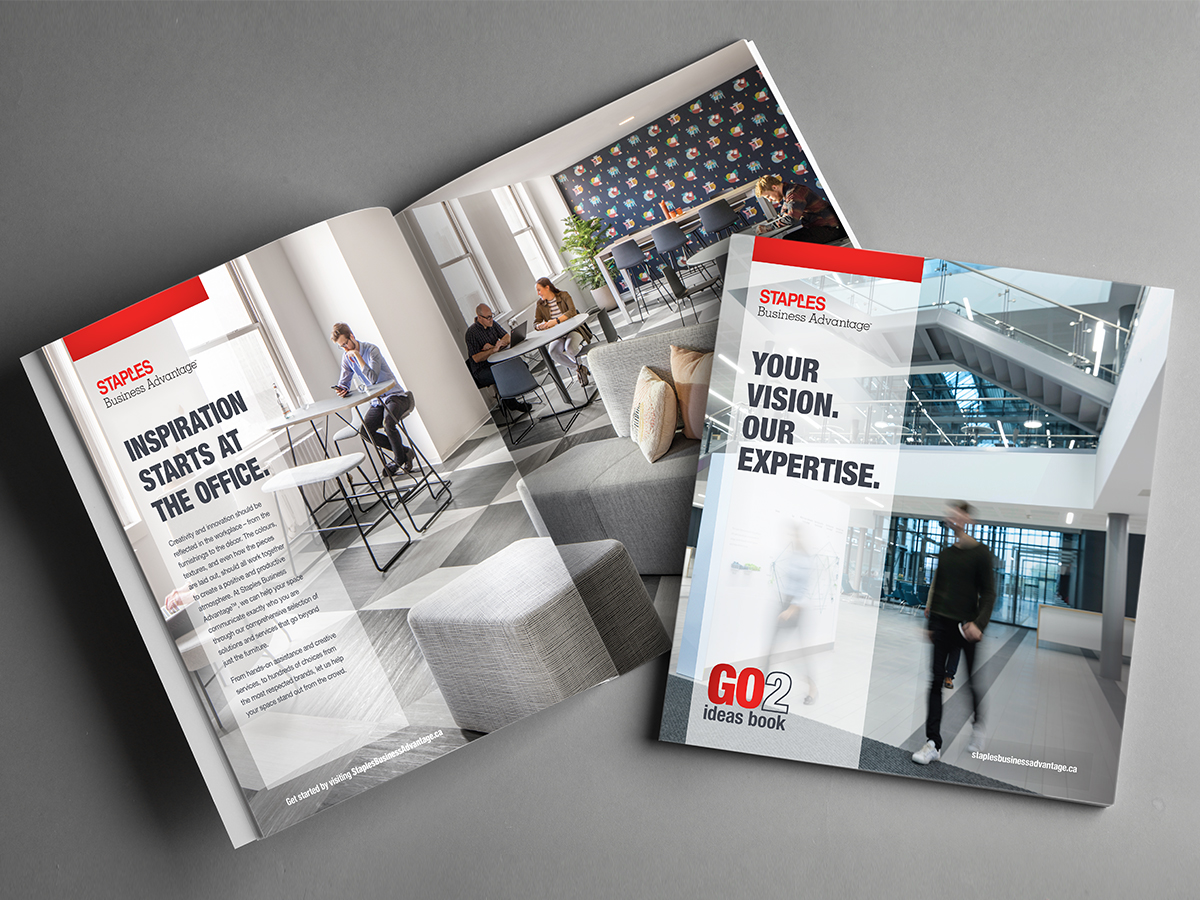
Staples Business Advantage - GO2 Ideas BookGraphic Design
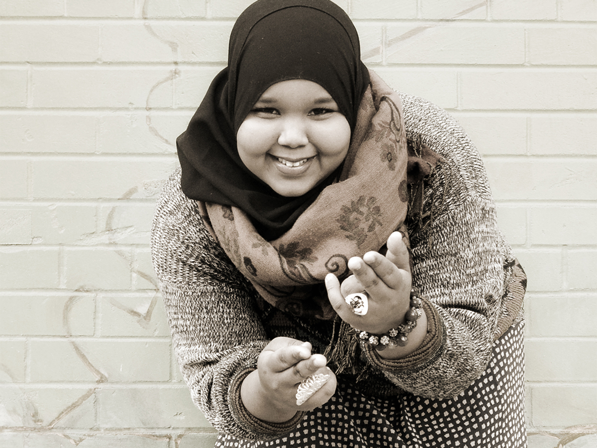
Editorial PhotographyPhotography
Street PhotographyPhotography

Sean TepperIllustration

The EyeopenerIllustration
