Mother Cocktail Bar + Crystal Head Vodka
Elevating the quarantini
In spring 2020, I was brought into a collaboration between Crystal Head Vodka and Mother Cocktail Bar in Toronto, in which the two businesses jointly launched a cocktail set that allowed consumers to enjoy high-end bar-quality cocktails at home.
As pandemic lockdowns forced bars to pivot, Mother transformed the way they crafted experiences for their guests by creating takeaway cocktails that not only tasted great, but also evoked the feel of bringing the bar home.
Client: Mother Cocktail Bar
Studio: In-house (Crystal Head Vodka)
Role: Graphic design, art direction, printing logistics
Project Date: 2020
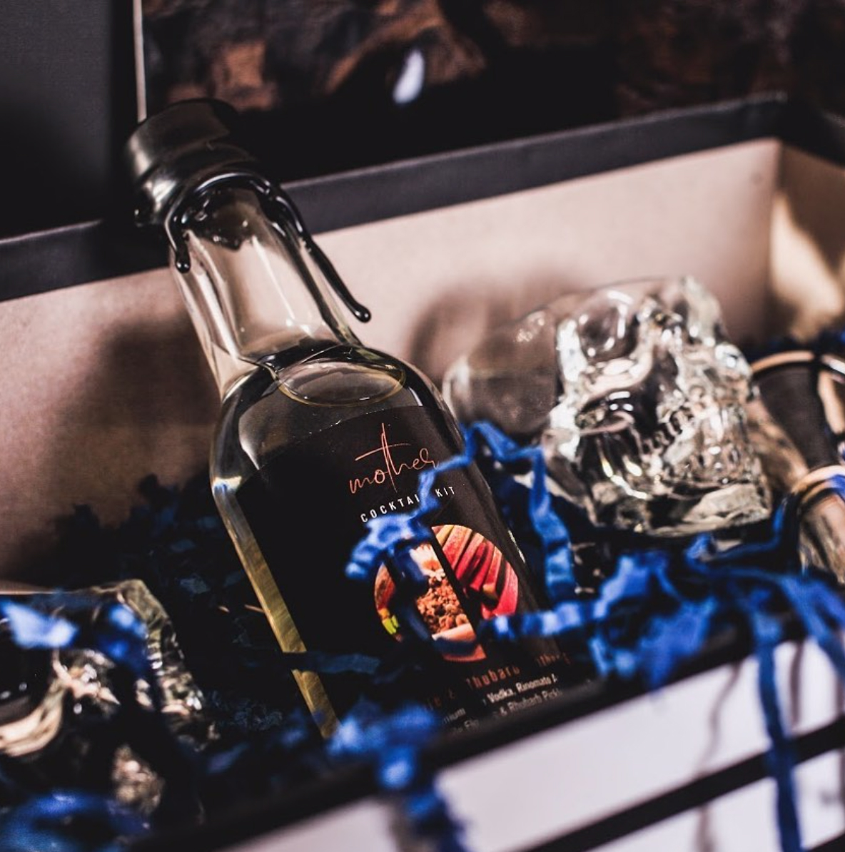
Photo by Mother Cocktail Bar
Finding Balance Between Two Brands
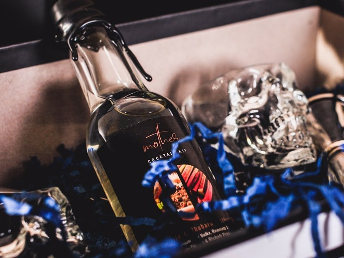
With the support of Crystal Head Vodka, Mother developed a chamomile and rhubarb-infused dirty martini that was sold in custom wax-sealed bottles along with a set of Crystal Head Vodka’s distinctive shot glasses.
The arrangement that Mother and Crystal Head negotiated was that the label design would follow the same basic format as the other bottled cocktails the bar had already developed, but would have a look and feel unique to Crystal Head. This allowed Mother to maintain visual cohesion in their branding message while also affording Crystal Head new channels for their own brand awareness and visibility.
The aim of the main graphics I selected was to highlight the botanicals present in the drink, as Mother is known for elevating high-quality, locally sourced natural ingredients through its bespoke cocktails. The organic textures carried into the background as well. A black slate was chosen to quickly and easily distinguish the Mother Gibson from the bar’s existing barrel-aged cocktail lineup, which featured warmer-hued wood textures.
In keeping with the natural and organic theme, the palette we settled on was black (a key colour in Crystal Head’s branding) and a golden-brown picked up from the images of the botanical ingredients. As a further nod to the Mother brand, these colours also complemented the palette of the bar’s physical space.
For the layout, I drafted several iterations of the geometric configurations to arrive at something unique to Crystal Head, which is known for its bold design and creative spirit. The version that eventually won favour with all of us broke conventional framing, splicing the photos together in a harmonious way, in reference to Crystal Head’s outside-the-box style.
As final touches, I worked with the print shop to find a paper texture that conveyed luxury, and to fix quality issues such as thin text lost due to dot gain.
Ultimately, the goal was to capture a look and feel of luxury of a premium vodka brand mixed with down-to-earth comfort of the bar. Together, we wanted to provide a creature comfort to be enjoyed in one’s home during quarantine, while also reminding patrons of the ambience of a physical space they would want to return to once bars and restaurants could reopen for in-person service.
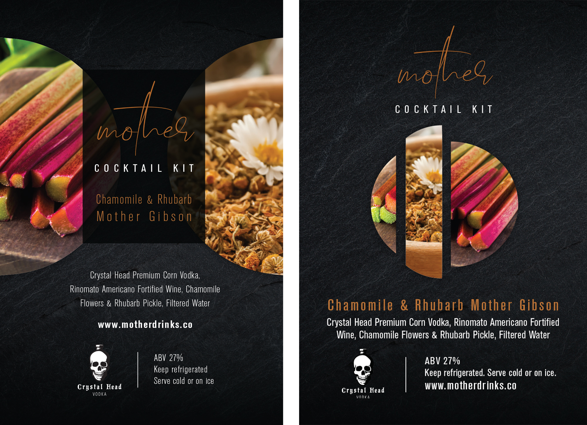
An earlier draft versus the version selected for print
Ongoing Partnership
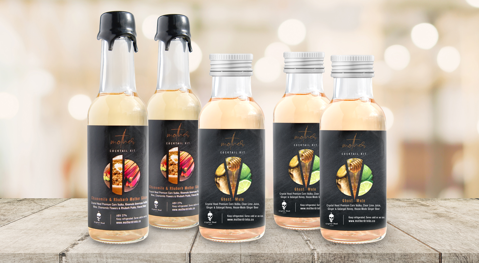
The 40 initial units from this collaboration performed well, and I was asked to create the label for another takeaway cocktail – the Ghost Mule – that Mother developed with Crystal Head subsequently.
The ongoing partnership between the two businesses remains strong years later. The Ghost Mule is still listed on Mother’s online store, in addition to the other listings Crystal Head has on their bar menu. Crystal Head also saw strong sales as a result, and received great visibility from the collaboration with Mother – one of their top-performing on-premise accounts in the region.
Credits
Creative Direction & Brand Partnership:
Massimo Zitti | Mother Cocktail Bar drinks team
Andrew Daw | Crystal Head Vodka brand team
Photography:
Jess Tsang
Mother Cocktail Bar
View more projects
Mother Cocktail Bar + Crystal Head VodkaBranding & Graphic Design
Staples Business Advantage - GO2 Ideas BookGraphic Design
Editorial PhotographyPhotography
Street PhotographyPhotography

Sean TepperIllustration

The EyeopenerIllustration
